How to Build a Career Page That Converts Top Talent (Walk Through a Real-World Case Study)
Last Updated Nov 25, 2025

Key Takeaways
- Your careers page is a primary brand and conversion asset. Most companies treat it like a checkbox or a link to the ATS, but candidates experience it as a first impression and decision hub. When you reframe it as a marketing funnel instead of a bulletin board, it becomes a powerful tool to attract, filter, and convert the right talent.
- Authenticity is the foundation of a high-performing careers page. Generic slogans and repurposed About Us copy don’t answer what candidates really care about: mission, values, growth, and real day-to-day experience. Centering employee stories, transparent DEI practices, and a clear EVP helps talent self-select in or out—and builds trust before they ever click “Apply.”
- A candidate-centric user experience is just as important as compelling content. Even the strongest EVP will fail if the page is slow, cluttered, or hard to use—especially on mobile. Clear structure, scannable sections, robust role filters, and fast, mobile-first design show respect for candidates’ time and dramatically improve conversion.
- Optimization turns a static careers page into a living, high-converting funnel. Treat your page like a growth asset: invest in SEO for job searches, integrate tightly with your ATS, and run ongoing A/B tests on headlines, CTAs, and layouts. Continuous iteration based on behavior and feedback keeps the page relevant, efficient, and aligned with your hiring goals.
- The teams that win track career-page KPIs that go beyond vanity metrics. Focusing on application conversion rate, form drop-off, engagement, and source of hire reveals where candidates get stuck and which channels actually deliver quality talent. When you measure, learn, and adjust systematically, your careers page evolves from “nice to have” into a measurable driver of recruiting ROI.
Too many organizations treat their careers page like a checkbox. But the smartest HR teams? They treat it like a conversion engine.
This one digital touchpoint shapes how talent sees your culture, evaluates your promise, and decides whether to click “Apply” or walk away. And the difference between a static, stale page and one built to convert? It’s not magic—it’s strategy.
So stop leaking talent with outdated listings and generic slogans. Start building a careers page that feels like your best recruiter—always on, always compelling, always clear about why your company is worth joining.
Elevate your strategy. Own your story. And turn your careers page into your #1 hiring asset.
The Most Common Mistakes Brands Make on Their Career Pages
Let’s be honest: most careers pages aren’t pulling their weight.
They’re often tucked away at the bottom of a website, filled with boilerplate text, outdated listings, or templated content straight from the ATS. They exist because they have to—but rarely because someone invested in making them convert.
And that’s a huge missed opportunity.
In a hiring landscape where job seekers are behaving more like savvy consumers, your careers page is not just a list of openings—it’s your frontline brand experience. In fact, it may be the first—and only—impression a candidate gets of your organization. So, if that page isn’t crafted with intention, you're leaking talent before the first conversation even happens.
Here are a few of the most common pitfalls:
- The "Link Graveyard" Problem
You’ve seen this one. It’s that careers page with a single sentence and a hyperlink to a third-party job board. There’s no context, no personality, no story—and no reason to stick around. Candidates bounce because there’s nothing to engage with.
- Copy-Paste Culture
If your page is just repurposed About Us content with a list of open roles, you're not telling candidates what they really want to know: What’s it like to work here? What does growth look like? What’s the mission? Job seekers crave substance, not slogans.
- Zero Differentiation
Without unique content—like employee testimonials, a clear employee value proposition, or visuals from your real workplace—your careers page becomes interchangeable with everyone else’s. If you're not showing who you are, you're forcing top talent to guess. And when they guess wrong? They walk away.
- One-Size-Fits-All Design
Today’s candidates access your careers page on a variety of devices. But many pages still aren’t mobile-friendly. When it’s hard to search for roles, slow to load, or cluttered with walls of text, candidates don’t convert—they click away.
- Ignoring the Funnel
Think of your careers page like a marketing funnel. Each piece of content should guide candidates one step closer to applying. But many pages lack calls-to-action, don’t explain what happens after clicking “Apply,” and leave candidates in the dark. The result? Abandonment.
The good news? These mistakes aren’t permanent.
In the next section, we’ll reframe your careers page as a powerful owned asset—your best opportunity to convert top-tier candidates and clearly communicate your employer brand.
Because when you stop treating your careers page like a checkbox and start treating it like a conversion tool, everything changes.
The Strategic Shift: Your Careers Page Is Your #1 Talent Asset
Imagine this: You’re investing in recruitment marketing, posting on job boards, attending career fairs, optimizing your LinkedIn strategy—and all of it is pointing candidates back to one thing.
Your careers page.
This is your owned, always-on asset. Unlike a job post that disappears after 30 days or a social media story that vanishes in 24 hours, your careers page is the one place where you fully control the candidate experience. It’s your storytelling canvas and your conversion engine.
And here’s the shift that high-performing HR teams are making: they’re treating their careers page like a marketing funnel.
Because that’s exactly what it is.
Your careers page isn’t just a digital bulletin board—it’s a decision-making hub. It’s where job seekers decide if they can see themselves in your mission, your values, and your work environment. It’s where passive candidates become active ones. It’s where talent gets off the fence and into your pipeline.
So, what sets a high-converting careers page apart?
Three foundational pillars:
- Authenticity
Candidates are smart. They can spot fluff from a mile away. Authentic content—like real employee voices, transparent DEI practices, and honest talk about growth and challenges—builds trust. It helps talent self-select in.
- Candidate-Centric UX
It doesn’t matter how strong your EVP is if the page is hard to use. Design your careers page like a great landing page: scannable, mobile-optimized, and built to guide users toward action. Prioritize searchability, clarity, and speed.
- Data-Driven Optimization
Your careers page isn’t “set it and forget it.” The best talent teams treat it like any other high-value asset: they measure performance, gather feedback, and run A/B tests. Iteration is what keeps it relevant—and high converting.
Next up, we’ll break down exactly how to bring this strategy to life with best practices for making your page shine.
Because when done right, your careers page becomes a magnet for mission-aligned talent—and a direct driver of recruitment ROI.
Best Practice 1: Include Authentic Content That Helps Job Seekers Get to Know Your Organization
Let’s face it: today’s candidates aren’t just looking for a job. They’re looking for a sense of purpose, belonging, and alignment.
That means your careers page can’t just be a resume submission portal—it needs to act like a window into your culture.
So, how do you build authenticity into your careers page? You lead with content that’s real, relatable, and rooted in your company’s values. Here’s how.
Lead With Your Mission—Right at the Top
Your headline matters. The very first thing someone sees on your careers page should be a hero statement that reflects your mission, not your market share. When done right, this copy becomes a cultural filter: the right people lean in, and the wrong people self-select out.
Want to make an immediate impact? Position your mission and values front and center, above the fold. Think: “We’re on a mission to make wellness universal”—not “Join our award-winning team.”
Make Your EVP Unmissable
Your employee value proposition (EVP) isn’t just a bullet list of benefits. It’s your promise to your people. What do employees gain—beyond salary—by working with you? Make sure your careers page articulates this clearly, consistently, and repeatedly.
You don’t need to call it an EVP explicitly—but you do need to show what makes your company a great place to grow. Weave this throughout the page, from culture statements to benefits callouts.
Let Employees Do the Talking
It’s not enough to say “our people love it here.” You have to show it.
Replace generic testimonials with employee stories that go deep. Include quotes that reflect personal growth, not just perks. Better yet, bring their voices to life with video clips, audio snippets, or written profiles from a range of departments and experience levels. This adds both dimension and credibility.
And don’t forget to highlight real moments—new hire experiences, internal promotions, community initiatives. These are the stories that stick.
Showcase Recognition—With Context
If your company has won employer awards, been featured in media, or ranks highly on review platforms, don’t bury it in the footer. Use those signals to reinforce credibility. Just make sure you frame them around why they matter to a candidate.
For example: “Named a Best Place to Work by XYZ—for our people-first approach to flexibility, development, and wellbeing.”
Deliver Transparency
In the age of information, today’s job seekers aren’t just hoping for transparency—they expect it. They want to understand the full employee experience before they apply. That includes clarity around pay, perks, culture, and what you’re actively doing to support inclusion, growth, and balance.
Transparency shows respect for a candidate’s time and values. It signals that your organization is confident, consistent, and serious about creating a great employee experience.
When you’re upfront, you invite trust—and that trust drives action.
Here’s how:
Transparency Area | What to Include | Why It Matters |
| Benefits | Organized by theme (e.g., “Support for Your Health,” “Flexibility & Family”) | Improves scanability and helps candidates self-assess fit |
| DEI | Specific actions, not just statements—like ERGs, leadership demographics, or DEI goals | Demonstrates accountability |
| Salary & Location | Clear ranges and remote/hybrid/onsite requirements | Candidates expect this upfront—leaving it out increases bounce rates |
So, before you publish your next update to the careers page, ask yourself this: Would a candidate walk away with a clear sense of who we are—and why we’re worth joining?
If the answer is “maybe,” it’s time to rework the page with real stories and real stakes.
Highlight Employee Wellbeing
Wellbeing is table stakes today:
- 86% of employees consider their wellbeing at work to be just as important as their salary
- 85% say they would consider leaving a company that doesn’t prioritize wellbeing
- 81% believe it’s their employer’s responsibility to help them care for their wellbeing
- 85% say they will only consider companies that visibly prioritize wellbeing in their employee experience
Candidates are making decisions based on more than compensation. They’re asking: Will this company support my health? Will I be able to grow here without burning out?
In short? If your careers page doesn’t clearly communicate how you support employee wellbeing, you're losing talent to the employers who do.
Here’s how to highlight your wellbeing commitment:
- Make it visible: Dedicate a section of your careers page to your wellbeing programs, partnerships, and perks.
- Get specific: Go beyond “we care about wellness.” Talk about gym memberships, mental health resources, time-off policies, and flexible schedules.
- Show proof: Share employee testimonials about how your company has supported their wellbeing—especially during high-stress seasons or life changes.
And remember: your investment in wellbeing isn’t just good for people—it’s great for business. A strong wellbeing program improves performance, reduces turnover, and increases retention—all outcomes your careers page can and should help drive.
Best Practice 2: Provide a Candidate-Centric User Experience
Your careers page may have incredible content—but if it’s hard to navigate, slow to load, or clunky on mobile, most candidates won’t stick around to read it.
User experience isn’t just about design—it’s about respecting your candidates’ time.
Think of your careers page like any high-performing landing page: it should guide the user clearly, quickly, and confidently toward action. And that means putting their needs first.
Let’s break down how to do just that.
Clear Page Structure That Supports the Candidate Journey
A great user experience starts with clear structure. Candidates should be able to find what they need without hunting or guessing. Here’s how to design a page that works for them:
- Create intuitive content zones. Separate your mission, employee value proposition, open roles, benefits, DEI initiatives, and application process into well-defined sections.
- Use descriptive subheadings. Help users scan with headers like “What It’s Like to Work Here,” “How We Support Growth,” or “Open Positions.”
- Place key information above the fold. Your hero section should feature a value-driven headline, plus a strong call to action (CTA) to explore roles or learn more.
Remember: job seekers are goal-oriented. Make it as easy as possible for them to find what they came for.
The Mobile Imperative
Four out of five job seekers are starting their search from their phones—and if your careers page doesn’t load well on mobile, they’re gone.
Here’s your mobile-first checklist:
Mobile User Experience Must-Have | Why It Matters |
| Short paragraphs | Easier to read on small screens |
| Clear, sticky navigation | Keeps users oriented and engaged |
| Large touch targets | Reduces frustration and drop-off |
| Fast loading time | Slow pages = lost candidates |
| Minimal pop-ups | Keeps focus on job content, not distractions |
Best Practice 3: Optimize the Page so Traffic Turns into Candidates
You’ve built an authentic, mobile-friendly careers page that reflects your values. Amazing. Now let’s make sure it works—by turning that hard-earned traffic into actual applicants.
Think of your careers page like a high-converting marketing funnel. The goal isn’t just to drive views—it’s to drive action. That means every headline, job listing, and button needs to help the right people say: “Yes, I’m ready to apply.”
Here’s how to make that happen.
SEO for Talent Acquisition
Before someone ever lands on your careers page, they’re probably typing a search like “marketing manager jobs in Austin” or “remote software engineer role” into Google. If your job listings—and your page structure—aren’t optimized for search, you’re missing out on top-of-funnel traffic.
Here’s how to fix that:
- Use role-specific, location-based keywords in job titles and descriptions (e.g. “Customer Success Manager – Remote”).
- Make job descriptions readable and engaging—skip the jargon and tell a story.
- Structure your page with clear H1s, H2s, and meta descriptions so Google (and candidates) can find what they need.
And don’t forget accessibility. Make sure your page is WCAG compliant, with alt text for images, keyboard navigability, and clear contrast for readability.
Leverage Technology—and Iteration
Your careers page should be a living, breathing conversion machine—not a one-and-done project.
Here’s how top teams keep theirs performing:
Optimization Area | Why It Matters | What To Do |
| ATS Integration | Ensures accurate tracking and reduces friction for candidates | Sync your careers page with your ATS for seamless data management |
| A/B Testing | Helps you understand what converts best | Test headlines, CTA buttons, and job description formats regularly |
| Application Funnel Tracking | Reveals where candidates drop off | Use analytics to monitor form completion rates, bounce rates, and time on page |
| Feedback Loops | Gives real-time insight into candidate experience | Ask candidates why they applied—or why they didn’t finish |
The teams who treat their careers page like a growth asset, not a static web page? They’re the ones hiring faster, better, and more cost-effectively.
How to Build an Effective Careers Page, Step by Step
You don’t need a full rebrand or a massive tech overhaul to build a careers page that converts. What you do need is a clear strategy, a little cross-functional alignment, and a candidate-first mindset.
Let’s break it down into a simple, actionable roadmap:
Step 1: Get Clear on Your Employer Brand Story
Before you write a single headline, define your employee value proposition (EVP). What do people get—beyond a paycheck—when they work for you? What’s your mission, and how does it show up in everyday work?
This will anchor your messaging throughout the page. When your brand story is clear, everything else flows.
Step 2: Audit What You’ve Got
Start with what’s already live. Is the structure intuitive? Is the content up to date? Is the language candidate-friendly?
You might discover pages that are technically functional but emotionally flat—or job listings with vague, jargon-heavy descriptions. These are the quick wins you’ll want to clean up early.
Step 3: Map the Candidate Journey
Now ask: how do you want someone to move through your careers page?
A smart structure might look like this:
- Headline/Hero: Captures your mission and EVP
- Why Work Here?: Values, DEI, employee stories
- Benefits Snapshot: Organized by themes, not laundry lists
- Open Roles: With robust filters by location, team, and format
- Application FAQs: What to expect, timelines, who they’ll meet
This creates a guided flow from interest to intent.
Step 4: Optimize for Mobile and Search
Now that the structure is clear, make sure your page performs on mobile and ranks on Google. Use your ATS’s SEO tools—or partner with your marketing team—to ensure job titles, meta descriptions, and structured data are fully optimized.
Step 5: Measure, Learn, Iterate
You wouldn't launch a product without measuring performance—so don’t publish your careers page without a plan to improve it.
Track:
- Application conversion rate (visits → applicants)
- Drop-off points (where users bounce or exit)
- Time on page (is your content holding attention?
- Source of hire (how many qualified candidates are coming from organic vs. paid sources?)
Use this data to adjust copy, refine the CTA flow, or test new content formats.
Real-World Career Page Example: Why Wellhub’s Page Works
A high-performing careers page isn’t about slick design—it’s about clarity, credibility, and conversion. And Wellhub’s? We may be biased, but we think it’s a masterclass in all three.
Let’s take a scroll through the Wellhub careers page this real world example of an effective careers page. Every section you’re about to see shows a best practice in action—and offers a blueprint for how your own page can follow suit.
- Leading With Mission and Momentum
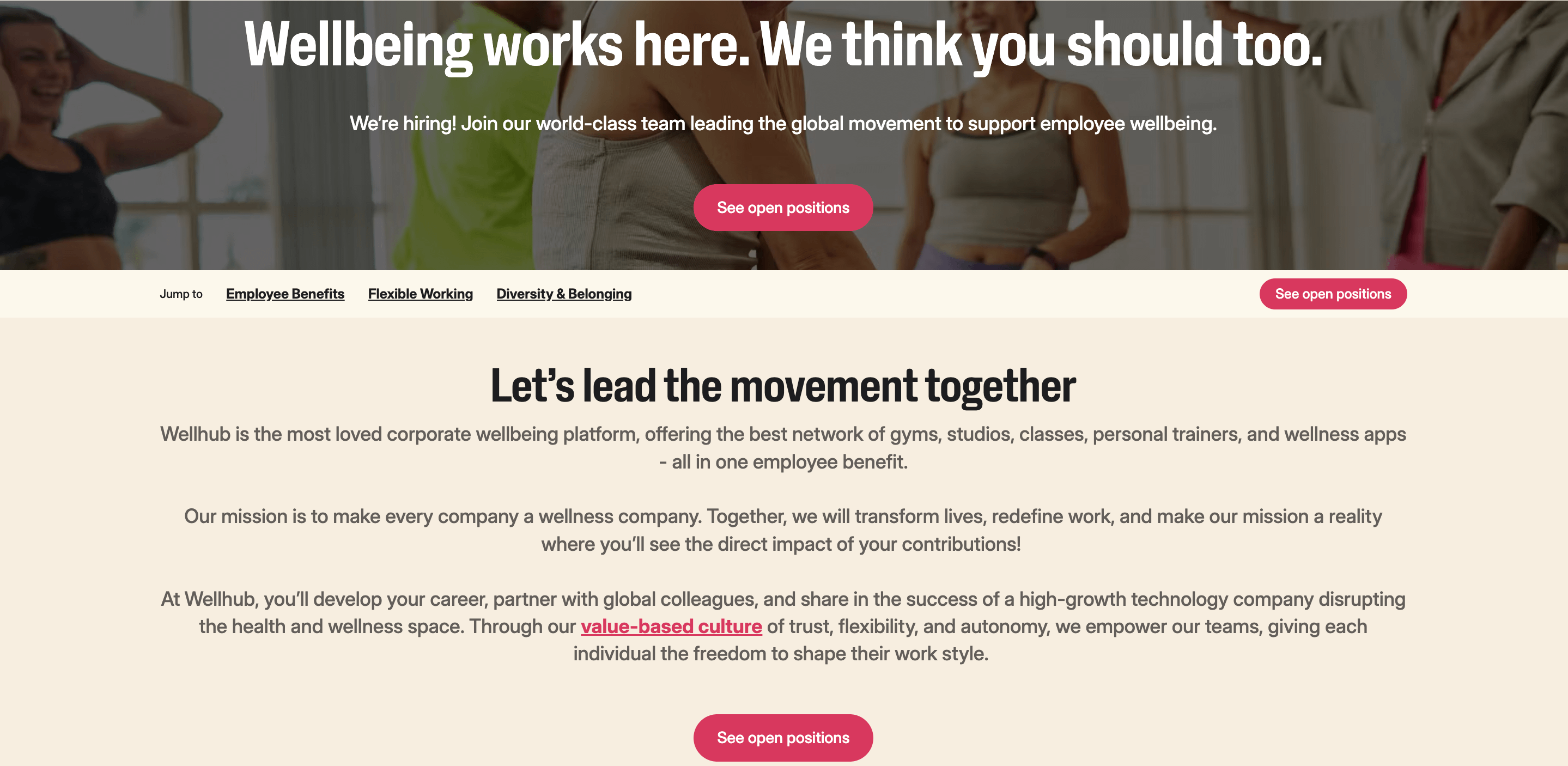
Right at the top, Wellhub’s page opens with a bold statement: “Wellbeing works here. We think you should too.”
It’s short. It’s mission-driven. And it immediately filters for cultural fit. The subheader backs this up by positioning Wellhub as a company leading the global wellbeing movement—then invites the candidate to join.
This is what we mean by leading with value and purpose. The CTA (“See open positions”) is unmissable, and it all appears above the fold. That’s not just good design—it’s high-converting UX.
- Showcasing Employee Value Through Benefits
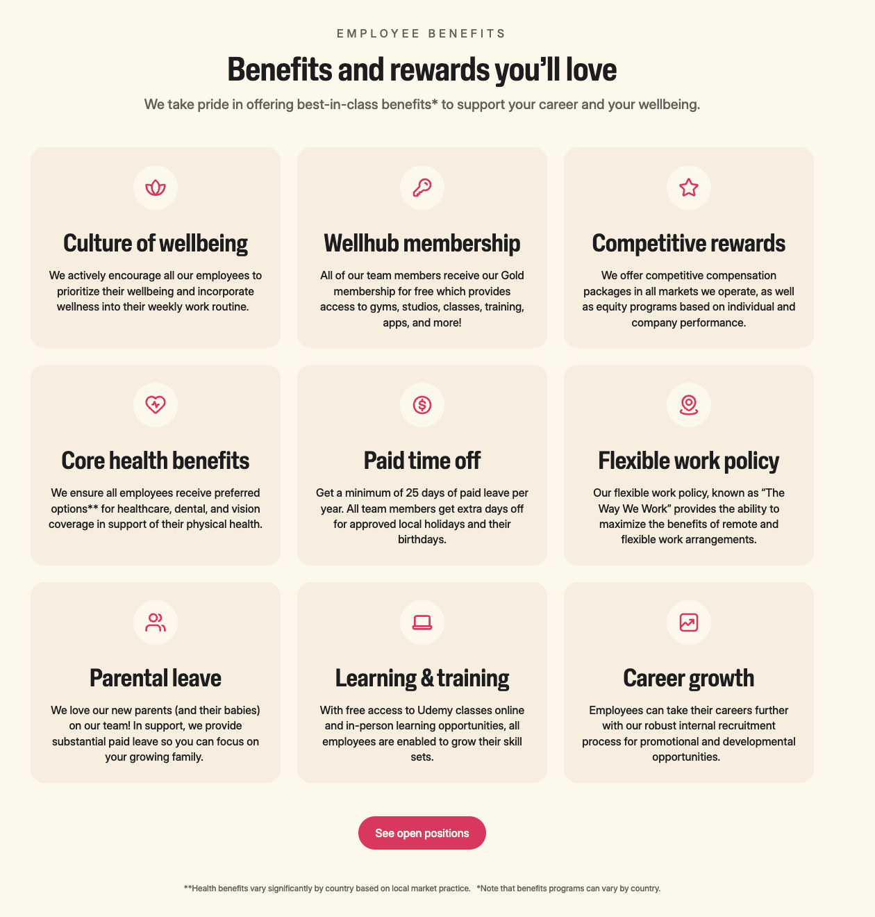
As you scroll down, you hit a section that proves Wellhub’s employee value proposition: a grid of clearly defined, best-in-class benefits.
Each tile (e.g., “Core health benefits,” “Paid time off,” “Learning & training”) comes with a plainspoken explanation. It’s easy to scan, mobile-friendly, and—most importantly—structured around what employees actually care about.
The layout and language support two pillars: transparency and wellbeing-first culture. And that drives trust.
- A Candidate-First Job Search Experience
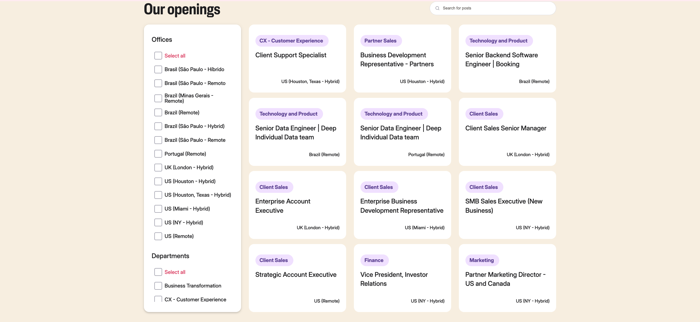
Next stop? The job listings. This section doesn’t just dump open roles—it makes them easy to search, filter, and understand.
Filters by location and department help candidates drill down quickly. Each job title is tagged with clear location info (e.g. “Remote,” “Hybrid”) so there’s no guessing.
This is a textbook example of a candidate-centric user experience. It respects the user’s time and moves them toward action.
- Bringing in Social Proof
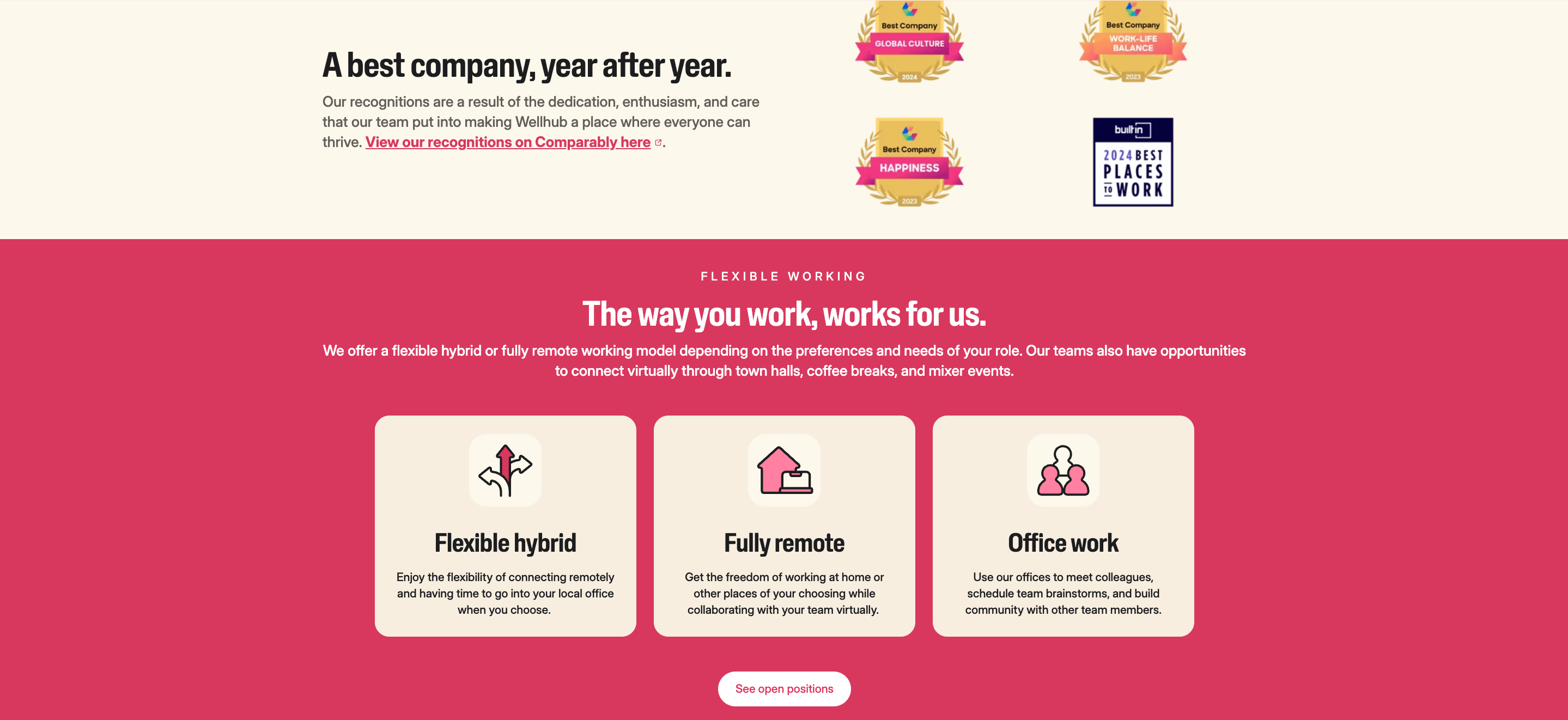
Credibility matters. This section showcases third-party recognitions like:
- Best Company for Global Culture
- Best Company for Work-Life Balance
- Built In’s 2024 Best Places to Work
These aren’t trophies—they’re trust signals. And they help validate the story the page is telling.
- Turning DEIB Into Action
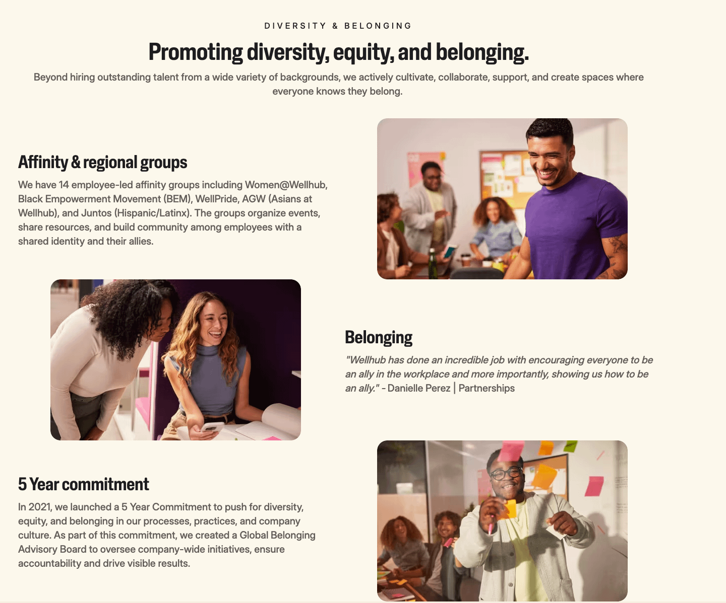
Further down, we see what DEIB looks like in practice. Affinity groups, a 5-year DEIB commitment, and a quote from an employee about allyship bring it all to life.
This is the difference between aspirational DEI language and actual inclusion work. It shows that belonging isn’t a buzzword at Wellhub—it’s a strategy.
- Giving Employees the Mic
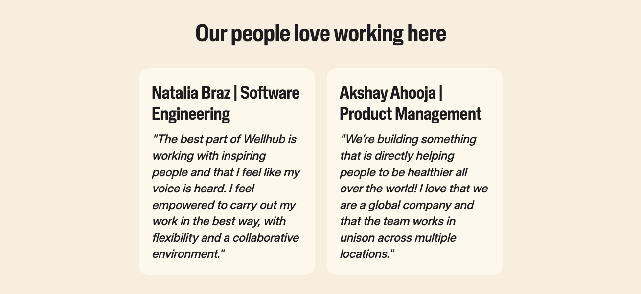
Now it’s time to hear from the people who know best: the employees.
Instead of bland testimonials, Wellhub features quotes from real team members in different departments. These testimonials touch on career growth, flexibility, collaboration, and empowerment—all in their own words.
It’s authentic. It’s human. And it’s persuasive.
- Ending With Clear Action and Connection
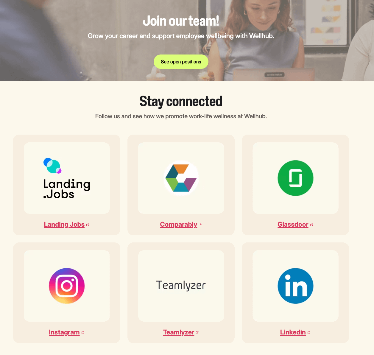
Finally, the page closes with another CTA (“See open positions”) and icons linking out to platforms like Glassdoor, LinkedIn, and Comparably.
This wraps the experience with two key takeaways:
- You know what to do next (apply).
- You can go deeper if you want (read reviews, check out socials).
That’s exactly how you close the loop on a high-converting funnel.
Final Takeaway: Wellhub’s careers page works because it’s intentional. Every section supports a strategic goal: communicate the mission, engage the candidate, and drive conversion.
Career Page KPIs: Focus on Conversion, Not Just Clicks
If your careers page looks great but doesn’t perform, it’s not doing its job. Tracking the right metrics is how you move from “pretty page” to “powerful recruitment engine.”
This section is all about measuring what matters—because when you treat your careers page like a marketing asset, you need marketing-quality metrics to prove its ROI.
Let’s look at the KPIs that tell you if your page is working and where you can improve.
Application Conversion Rate
What it is: The percentage of visitors to your careers page who complete a job application.
Why it matters: This is your ultimate measure of success. Are people landing on your page, liking what they see, and deciding to apply? If not, you’ve got a disconnect between content and intent.
How to improve it: Reduce friction. Simplify the application form. Add “Apply with LinkedIn” or resume upload. Use clear CTAs and keep page load times under 3 seconds. Make sure everything works beautifully on mobile.
Forms Drop-Off Rate
What it is: The percentage of candidates who start but don’t finish your application form.
Why it matters: This highlights friction. If too many people are bailing halfway through, your form might be too long, too confusing, or not mobile-friendly.
What to do: Audit your application flow. Eliminate redundant fields. Test a “Quick Apply” option. Always make sure candidates can complete the process without retyping their resume from scratch.
Time on Page / Engagement Rate
What it is: The average amount of time visitors spend on your careers page and how much they engage with its content.
Why it matters: More time = more interest. A short visit suggests your content isn’t resonating or your page doesn’t load properly.
Pro tip: Use tools like Hotjar or Google Analytics to see how users interact with different sections. If people are skipping past your EVP or bouncing before seeing open roles, it’s time to rework layout or messaging.
Source of Hire (Attribution)
What it is: Tracks where your candidates are coming from—organic search, job boards, social media, or direct traffic.
Why it matters: This helps you understand what’s driving quality traffic and which channels deserve more (or less) investment. If organic search leads to more applications than paid job boards, that tells you your careers page SEO is pulling its weight—and might justify reducing paid spend.
How to track it: Use UTM parameters on all recruitment links. Set up goal tracking in Google Analytics or your ATS. Regularly compare source data against conversion quality—not just volume.
Ongoing Testing and Improvement Metrics
Treat your careers page like any high-converting landing page. That means testing and iterating, not just posting and praying.
Here’s what to track:
Metric | Why It Matters | What to Test |
| CTA Click Rate | Measures how compelling your calls to action are | Button copy, placement, color |
| A/B Test Results | Reveals what actually converts | Headlines, testimonials, benefits layout |
| Drop-off by Device | Shows mobile vs. desktop friction points | Page speed, tap targets, navigation |
| Feedback from Candidates | Provides real-world context | Add optional surveys post-application |
When you monitor the right KPIs—and actually act on them—your careers page becomes more than a formality. It becomes a high-performance hiring machine.
And the best part? You already own this asset. The more intentional you are about optimizing it, the bigger the return.
A High-Performing Careers Page Starts With Employee Wellbeing
If your careers page feels generic, hard to navigate, or lacks personality, you're likely losing great candidates before they even apply. When job seekers don’t see what makes your company different—or how you support your people—they move on.
A strong employee wellbeing program helps fix that. It gives your company a clear story to tell, backed by real support for the people behind your success. When you show that you care about wellbeing, your careers page becomes more than a job board—it becomes a reason to join.
Speak with a Wellhub Wellbeing Specialist to turn candidate curiosity into confidence by showcasing your commitment to wellbeing.

Company healthcare costs drop by up to 35% with Wellhub*
See how we can help you reduce your healthcare spending.
[*] Based on proprietary research comparing healthcare costs of active Wellhub users to non-users.
Category
Share

The Wellhub Editorial Team empowers HR leaders to support worker wellbeing. Our original research, trend analyses, and helpful how-tos provide the tools they need to improve workforce wellness in today's fast-shifting professional landscape.
Subscribe
Our weekly newsletter is your source of education and inspiration to help you create a corporate wellness program that actually matters.
Subscribe
Our weekly newsletter is your source of education and inspiration to help you create a corporate wellness program that actually matters.
You May Also Like

Talent Acquisition Strategies: How to Attract Top Talent | Wellhub
Proven talent acquisition tactics to attract, engage, and retain top talent while boosting workplace wellness and long-term growth.

HR Guide to Recruiting Dashboards: Metrics, Building Templates & Examples | Wellhub
Overhaul your recruitment analytics with a perfectly optimized recruiting dashboard to track metrics like time-to-hire and cost-per-hire.

What is Yield Ratio? Definition, Formula, and Examples
Master the use of yield ratio in recruitment. Here’s the definition, how to calculate it, its benefits, and practical applications for HR efficiency.